
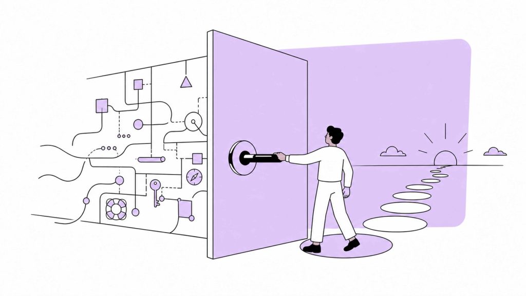
A business can have a clear strategy and still fail at the screen.
The positioning may be sharp. The offer may be well defined. The product may solve a real problem. The brand may look credible. But when a person enters the website, app, dashboard, or customer portal, the strategy has to survive contact with behavior.
People do not experience strategy as a document. They experience it as a path, a label, a button, a form, a choice, a delay, an error, a confirmation, a price table, a menu, or a moment of uncertainty.
Interface is where the business stops explaining itself and starts being used.
Users do not read the business plan
Teams often discuss the product from the inside.
They know the logic. They know the structure. They know why features exist. They know which page belongs to which business goal. They know the difference between packages, workflows, categories, and account states.
The user arrives without that internal map.
They scan. They guess. They compare. They decide whether the next click is worth it. They try to understand what is possible, what is expected, what is safe, and what will happen if they continue.
A strong interface respects this gap.
It does not assume the user has the same vocabulary as the team. It does not force people to decode internal categories. It does not hide important decisions behind clever design. It does not make the user feel stupid for not understanding the system.
Good interface design translates business logic into human action.
Every interface makes an argument
An interface tells the user what the business considers important.
If the first screen is crowded, the business is saying everything matters at once. If the pricing page hides the key difference between plans, the business is saying the buyer has to work for clarity. If onboarding asks for too much information too early, the business is saying its own data needs matter more than the user’s confidence. If the dashboard shows every metric equally, the business is avoiding prioritization.
These choices may be accidental, but the user still receives them as signals.
Interface design is not neutral. It shapes trust.
A calm, clear flow tells the user that the business understands the task. A confusing flow tells the user that the business may not understand its own system. A vague CTA tells the user that the company has not decided what should happen next. A weak error message tells the user that their problem was not anticipated.
The interface is always communicating.
Strategy should decide the hierarchy
Most interface problems are hierarchy problems.
What should the user notice first?
What should be understood before action?
What choices should be removed?
What information should appear later?
What should be repeated because it matters?
What should be hidden because it creates noise?
These are strategic questions before they are design questions.
A luxury service should not force the user through a cheap-looking lead form. A product built around speed should not begin with a slow onboarding flow. A platform claiming intelligence should not bury the main insight under secondary widgets. A consultancy selling clarity should not use a homepage that requires interpretation.
The hierarchy of the interface should reflect the hierarchy of the business.
When strategy is unclear, interface decisions become aesthetic debates. When strategy is clear, design has a standard.
Friction is not always the enemy
Many teams talk about removing friction as if every extra step is bad.
Some friction is waste. A confusing form, unnecessary account creation, unclear navigation, repeated data entry, slow loading, or hidden pricing can damage trust.
But some friction protects the experience.
A serious B2B service may need a qualification step before booking a call. A financial product may need careful confirmation before action. A complex platform may need guided onboarding instead of instant access. A high-touch advisory business may need fewer leads and better-fit conversations.
The goal is not to remove every step. The goal is to remove stupid friction and keep useful friction.
Useful friction helps the user make a better decision. Stupid friction exists because the business did not design the path properly.
Interface design should know the difference.
Microcopy carries business judgment
Small pieces of text often reveal the quality of thinking behind the product.
Button labels. Empty states. Error messages. Form instructions. Pricing notes. Tooltips. Confirmation screens. Onboarding prompts. These are not minor details. They are moments where the system speaks directly to the user.
Generic microcopy creates uncertainty.
“Submit” says less than “Request a consultation.” “Learn more” says less than “See how the process works.” “Something went wrong” says less than “Your payment was not processed. No charge was made. Try again or contact support.”
Good microcopy reduces the need for support because it answers the question at the point of confusion.
It also keeps the brand honest. A brand cannot claim to be clear if its interface speaks in vague system language.
Behavior reveals the truth
Teams can argue about design opinions for weeks. User behavior cuts through many of those arguments.
Where do people hesitate?
Which fields do they abandon?
Which page do they revisit before buying?
What do they search for?
Where do they contact support?
Which feature is ignored because the label is unclear?
Which step creates anxiety?
Behavior shows where the interface is failing to carry the strategy.
But behavior still needs interpretation. Analytics may show drop-off, but judgment is needed to understand whether the cause is weak value, poor hierarchy, unclear copy, missing proof, bad timing, or a mismatch between traffic and offer.
Interface work should combine observation, data, and strategic reading. Numbers show the pattern. Designers and strategists need to understand the meaning of the pattern.
The interface should make the business feel coherent
A good interface does not simply help users complete tasks. It makes the business feel coherent.
The promise on the homepage connects to the product flow. The product flow connects to onboarding. Onboarding connects to support. Support connects to retention. Each touchpoint reinforces the same understanding.
This is rare because many interfaces are built in pieces. A landing page is designed by one team. The product is shaped by another. Sales materials come from another. Support writes its own answers. Over time, the user experiences a patchwork.
Coherence requires someone to look across the whole path.
What does the user believe before arriving?
What do they need to understand at each step?
What should they feel confident doing next?
Where does the system need to reassure them?
Where should the business stay quiet and let the task happen?
These questions turn interface work into business design.
The screen is not the surface. It is the test.
Interface is often treated as the visible layer of a product. In practice, it is a test of everything beneath it.
If the offer is unclear, the page will struggle. If the product logic is messy, the navigation will show it. If the brand promise is exaggerated, the experience will expose it. If the business has not chosen its priorities, the interface will become crowded.
A screen cannot hide confusion forever.
The best interface work does not start by asking how something should look. It starts by asking what the user needs to understand, decide, and do.
That is where strategy becomes behavior.
And behavior is where the market decides whether the strategy was real.